Countdown
Download
Focus Mode
Font Size
Component Feature
Countdown component for displaying remaining time, customizable style and complete callback.
Basic Usage
Set the total duration and customize the display text for prefix and suffix.
Template example:
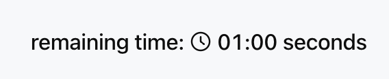
<Countdown duration={60} prefix="remaining time: " suffix=" seconds" />
Effect display as follows:
Attribute Description
Property Name | Type | Description | Default value |
duration ★ | number | Total Countdown Duration (Seconds) | - |
prefix | string | Countdown prefix text | - |
suffix | string | Countdown suffix text | - |
size | "xs" | "sm" | "md" | "lg" | "xl" | Component size (align with Text) | "md" |
color | string | ThemeColor | text color | - |
onComplete | ActionConfig | Action triggered when countdown ends | - |
Note:
★ Marked with required attribute.
Color Configuration
color property supports the following types:Text color tokens, such as
"text-primary", "text-secondary".Primitive color tokens, such as
"blue-500", "red-600".CSS color string, such as
"#FF0000", "rgb(255, 0, 0)".Theme-aware object
{ "light": "#000000", "dark": "#FFFFFF" }.Usage Examples
Template example:
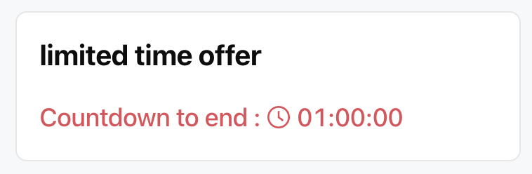
<Card><Title value="limited time offer" /><Countdownduration={3600}prefix="Countdown to end : "size="lg"color={{ light: "#E34D59", dark: "#F66F6A" }}onComplete={{type: "show_message",payload: { message: "Promotion stopped" }}}/></Card>
Effect display as follows:
Display Format
The countdown will automatically adjust the displayed content based on the remaining time.
Less than 1 minute: only display seconds, for example 59 seconds.
Less than 1 hour: display minutes and seconds, for example 12 minutes 30 seconds.
1 hour or more: display hours, minutes and seconds, for example 1 hour 15 minutes 20 seconds.
Help and Support
Was this page helpful?
You can also Contact sales or Submit a Ticket for help.
Help us improve! Rate your documentation experience in 5 mins.
Feedback